

LABORIE
Laborie is a global medical technology company based in New Hampshire in the US. Brandcraft won the pitch for this rebrand against several American agencies because Laborie preferred our methodology which, they said, “was about listening to us, working with us, and helping us through the rebranding process – and not about imposing your process upon us, which all the other agencies seemed keen to do”.
THE CHALLENGE
Over recent years Laborie has grown exponentially through the acquisition of several international specialist medical businesses and the resulting organisation had an unclear focus, mixed cultures, conflicting messaging and a range of visual communications inherited from acquired businesses that were out of step with each other. The challenge was therefore to help them define exactly what they do, develop their brand hierarchy, articulate their unique market positioning and purpose, and create a new brand identity and visual communications guidelines.
THE SOLUTION
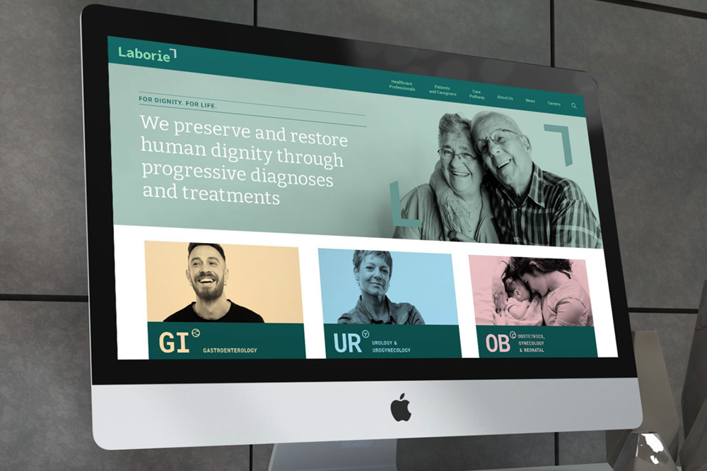
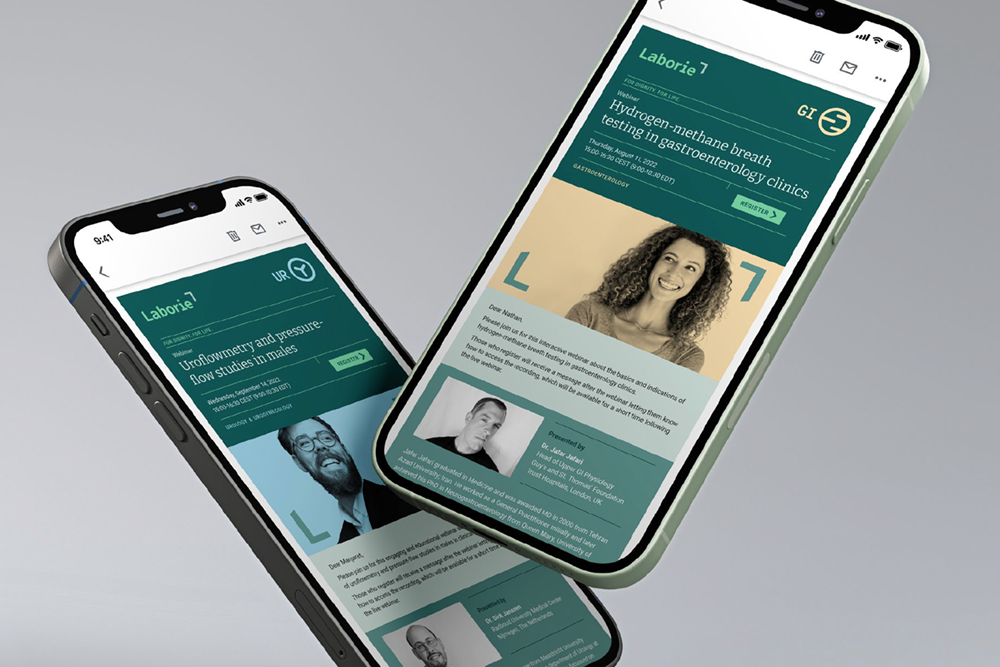
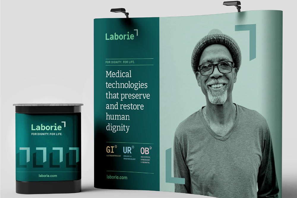
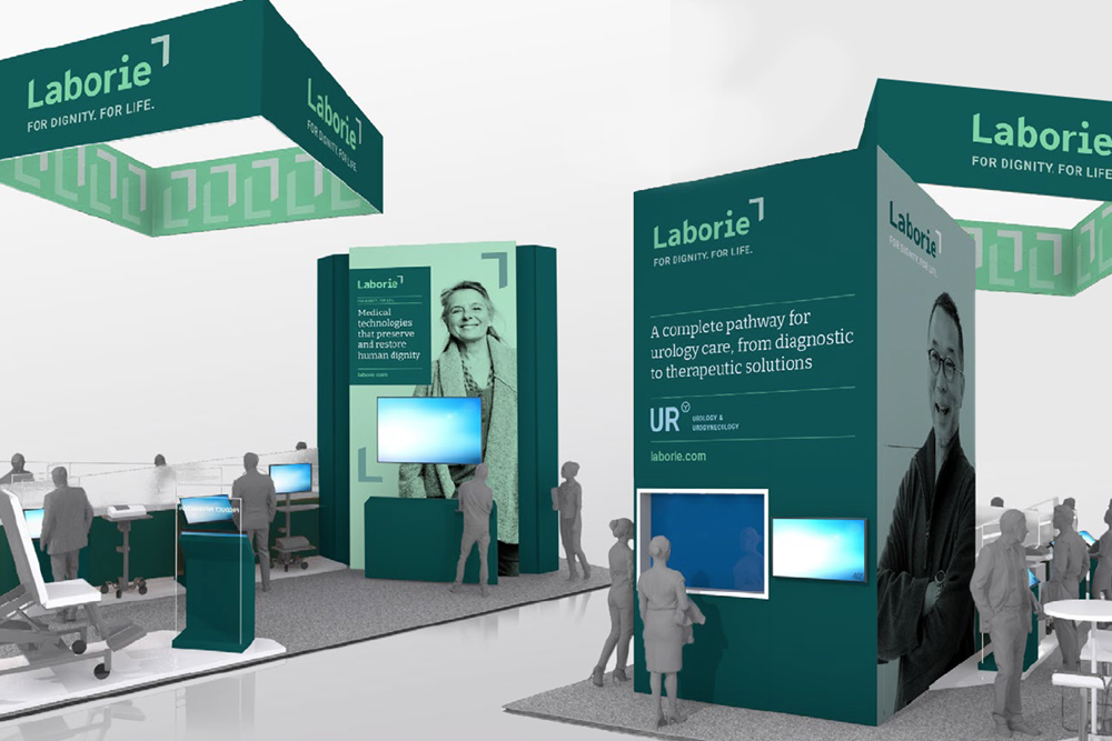
The resulting brand positioning defined that Laborie is a specialist medical technology company that exists to preserve and restore human dignity through progressive health diagnoses and treatments. Their businesses were clearly grouped into three segments – Urology, Gastroenterology and Obstetrics – under which their medical products could exist in a house of brands. We understood that many of the patients whose medical conditions necessitate the use of Laborie’s therapeutic devices are often experiencing a loss of dignity. Great healthcare is an essential safeguard of human dignity, so we articulated that Laborie are here to preserve and restore dignity. This was summarised in their new tagline: “For Dignity. For Life”
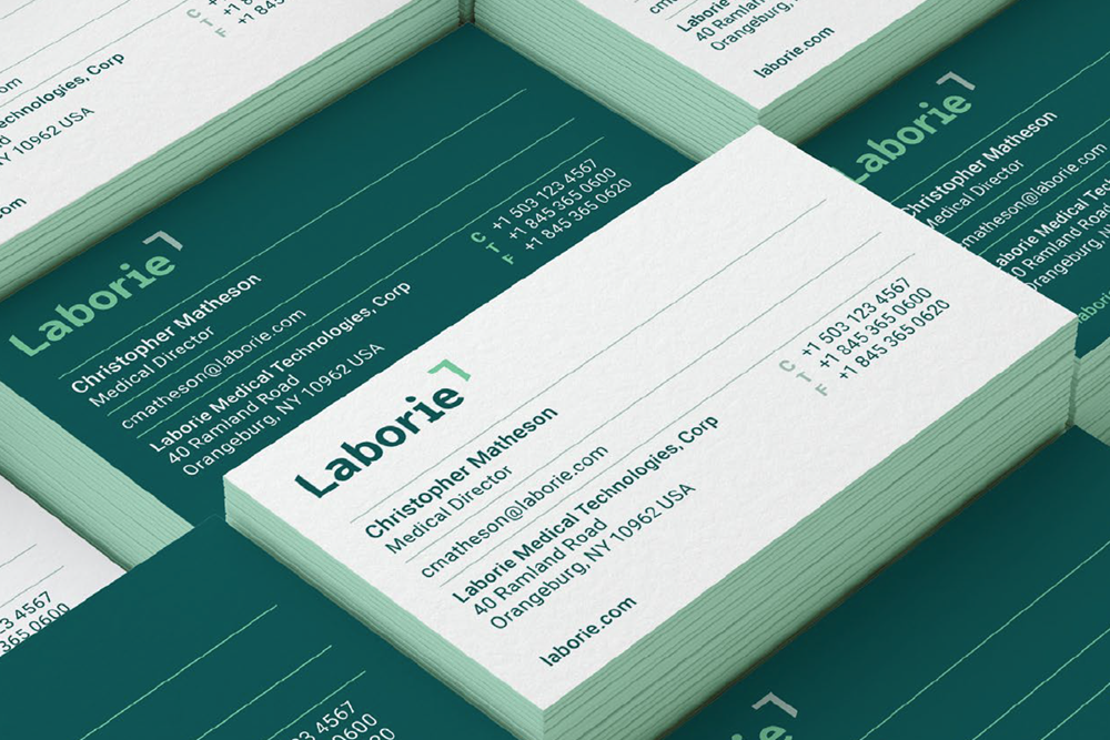
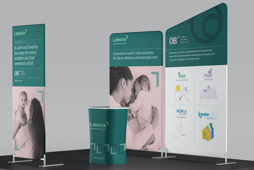
In keeping with this new brand positioning, the resulting brand identity framing device symbolises the preservation of dignity and care. The idea comes to life particularly when the device is used with imagery of Laborie’s diverse customers and patients. Our creative work deliberately had a dignified air to it, with a palette of subdued greens, complemented by accent colours which represented the three business segments. The typography style was understated and technical, and appropriate for a growing global technology leader.
We conceptualised event stands for their regular trade conferences, redesigned their comprehensive collection of brochures and manuals, developed customised Laborie iconography for their website and other presentations and developed full brand guidelines that contain the brand identity, palettes, typography, all graphic assets, we developed a large royalty free image library and usage guidelines, as well as extensive templates for Powerpoint, Word and other frequently-used applications.